BACKGROUND
Tintri products provides storage solution for data virtualization, designed for enterprise cloud, virtual machines and containers. The core product lines include: 1. Tintri Analytics (Cloud -based predictive analytics application to allow users to have visibility into every application), 2. Tintri Global Center (Console allows user to set policies for quality of service, cloning, snapshots and replication at the application level), and 3. VMstore (a storage system management application that simplify management in data center and cloud environments).
OVERVIEW
- My Role - Lead UX designer of TGC & VMstore
- Target User Virtualization & Storage Engineers
- Product Category Data Storage Solutions for Enterprise Cloud
- Length of the Project - Oct 2016 - Oct 2017

GOAL
Standardize navigation system, UI framework, unify interaction design consistently across all Tintri products (Tintri Analytics, Tintri Global Center, VMstore).
PROBLEMS
1. Inconsistent UI framework across three products
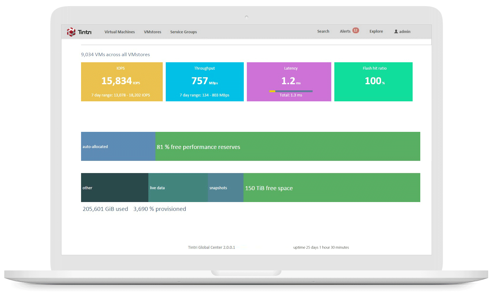
I started with an audit on three key products, and found that each product has different navigation systems, different dashboard designs and different interaction patterns. From product features perspective, Tintri Analytics allows users to have real-time prediction for storage and compute usage data for troubleshooting, vs. Tintri Global Center and VMstore both focus on managing virtual machine storage as day-to-day tasks for Storage Admins to backup and restore, set up protection policy...etc. The difference is Tintri Global Center allow Storage Admin to manage up to 64 Tintri systems, and VMstore can only manage 1 at a time.

Tintri Analytics
Tintri Global Center

VMstore
2. UI Framework issues in previous "Tintri Analytics" & "TGC"
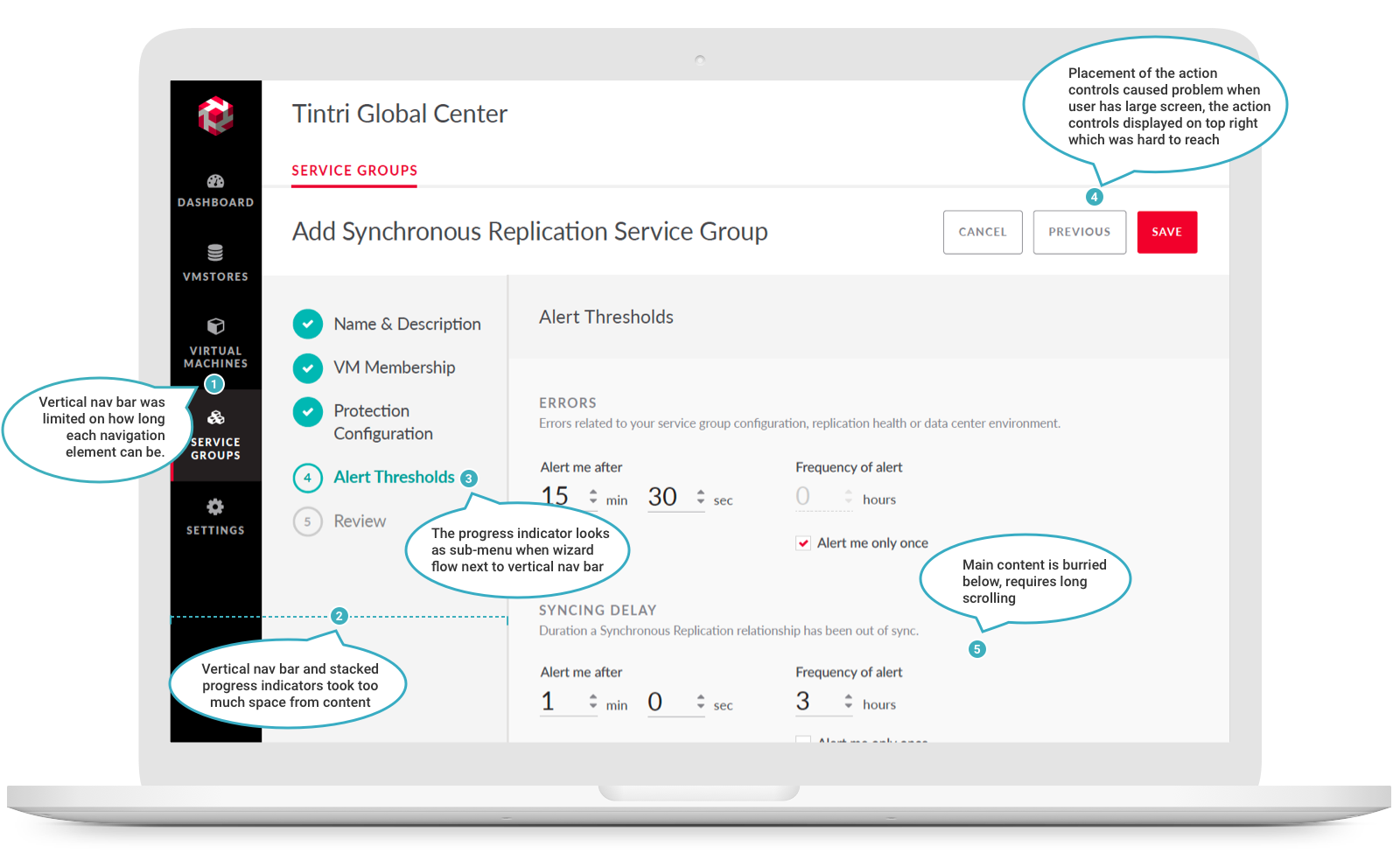
The vertical navigation bar was limited on how long each navigation element name can be. There was some confusion about the hierarchy of the primary and secondary navigation (one is vertical, the other horizontal and they are far from each other. User couldn't see all of the sub-navigation options until they load the main navigation item (Couldn't see what full options are).

3. Navigation & information hierarchy issues in previous TGC
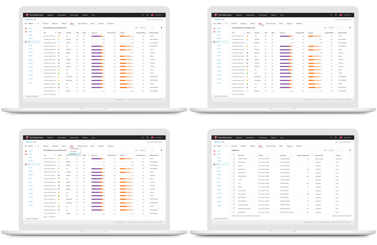
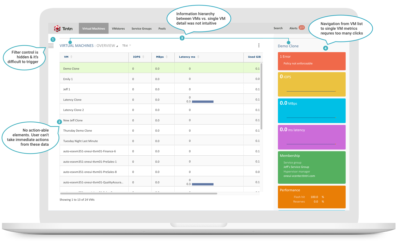
The previous TGC Virtual Machines list page had multiple usability issues. It was difficult to use especially for new users. The filter control was hidden on the side of the page and sometimes it was buggy to trigger the filter panel. There was no action-able elements on the data table, users can't take immediate actions from these data. The header of the list of VMs and the header of single VM did not have clear hierarchy. Navigating from VM list to VM metrics view requires 3 extra clicks. It was not intuitive and requires manual reading (extra learning time) for the users.
4. Usability issues in "VMstore"
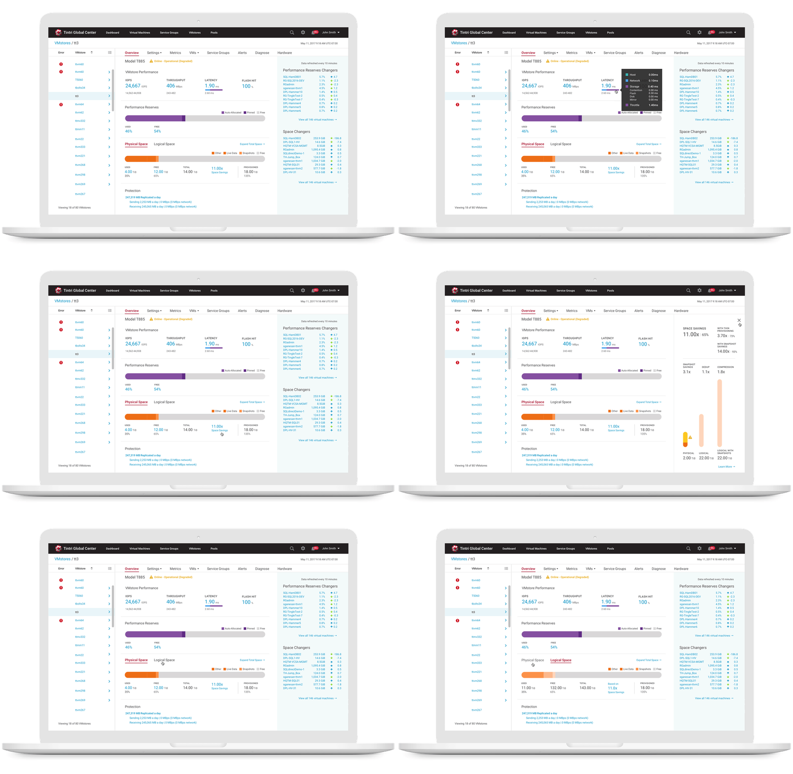
The VMstore overview tab provides high level information on each VMstore’s health, alerts for issues and help users make informed resource management decisions. Based on users testings and feedback, we found out the information on the previous screen was hard to read. Especially on the Physical Space and Logical Space information, which were not clearly defined. When VMstore physical space is running out, users want to know what's consuming the space. They would go to VMstore overview screen to find out the breakdown of each space usage by hovering over each value on the space gauge chart. The experience was terrible especially when the space usage is small, they need to hover over small chunk of data one by one to make proper decision. And when any of the sections on the bar is narrow/small, the label on top of it stays the same and the bar graph won't adjust accordingly to the real data. It caused user to read wrong data and it was difficult to distinguish from Physical Space vs. Logical Space at-a-glance.

PROCESS + SOLUTION
Defined Design Principles
Based on research studies and the audit of existing products, I came up with a list of design guiding principles to help internal teams focus on the same UX direction, and created a new UI shell that adopted the same design principles that expand the horizontal space and create unity across all products.
Eliminates the complexity of storage management and let users focus on what’s most important. Unify experience across all applications by simplify & streamline navigation flow. Enable clear information hierarchy & identify common interaction patterns to apply best practice experience.
2. Emphasis brand voice in boldness
Strong contrast with a touch of sophistication and high contrast colors to demonstrate the character of Tintri which never shies from tough problems and actively seeks unconventional solutions.
Early Sketch / Low-fid wireframe
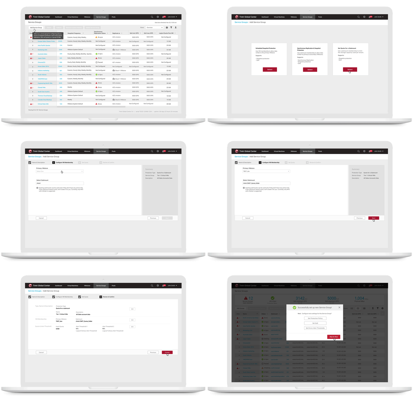
- Which navigation menu works best with configuration wizard flow?

2. Which navigation menu works best with large data table?

3. Which navigation menu works best with other Tintri product?

New UI Framework
We applied the new horizontal navigation framework and design patterns to "Tintri Global Center" & "Tintri Analytics" to ensure consistency across both products.

Visual Mocks
Tintri Global Center
Tintri Analytics
Combined VMstore with Tintri Global Center
With Tintri Global Center, users can see all their storage systems and be able to monitor performance, configure storage capacity & protection policy in a single pane view by selecting any storage system from the list (on the left panel) and view the details (on the right panel).

