My VMware Mobile Redesign

BACKGROUND

Many companies are initiating new mobile processes to increase system admins’ productivity & access to their internal network. All admins are frequently on calls, they are often required to remotely remediate infrastructure issues away from their desktop computers. They need to use My VMware to manage license keys & users permissions, filing support requests, connecting with the community or stay current on the latest technical issues, solutions or products updates. Their goal is to stay in control and be able to make smart decisions for their organizations any time, any where.

OVERVIEW

  • My Role - Lead UX designer
  • Target Users - System/Super Admins
  • Product Category - Productivity on Mobile
  • Length of the Project - 2012 - 2014 (Total of 5 releases)
GOAL

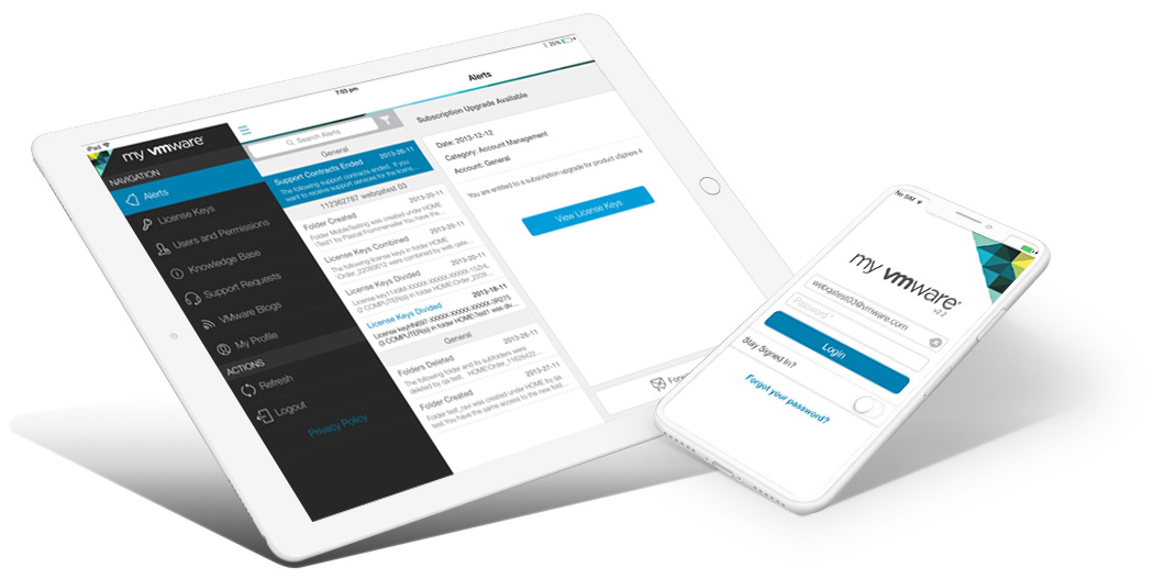
Redesign My VMware mobile app to improve overall user experience including information architect & navigation system to ensure alignment with user's mental model. Allow users to have both viewing and editing functions so they can access their VMware data any time, any where on their phones or tablets.

PROBLEMS

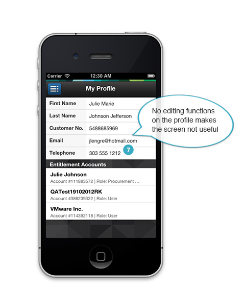
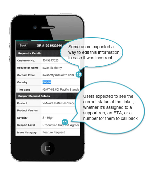
Audit of Previous Release + Users Study

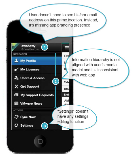
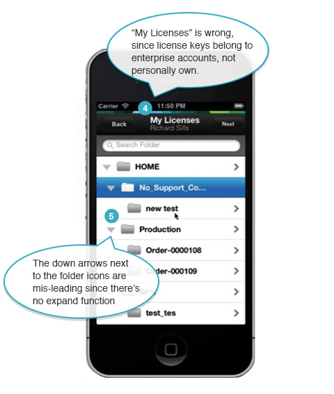
The initial step to start working on the redesign of My VMware mobile app was evaluating the existing product and analyzing end user behaviors, what were their goals, what were their tasks and what were their pain points with the existing app. I did an initial audit of the app from previous release, and later worked with AnswerLab to find out more details by interviewing twelve IT professionals who regularly login to My VMware web app. We were trying to find out:

  • What were their initial impressions when they first viewed the mobile app? Did users find it valuable to use My VMware on their smartphones?
  • In what context were they using the mobile app vs. desktop version?
  • Were they able to accomplish key tasks on My VMware mobile? (Filing and viewing Support Requests, viewing License Keys and Users and Permissions)
  • Did they feel like there were any actions they’d like to take that was missing on the mobile app?
  •  

SOLUTION

UI Framework Redesign

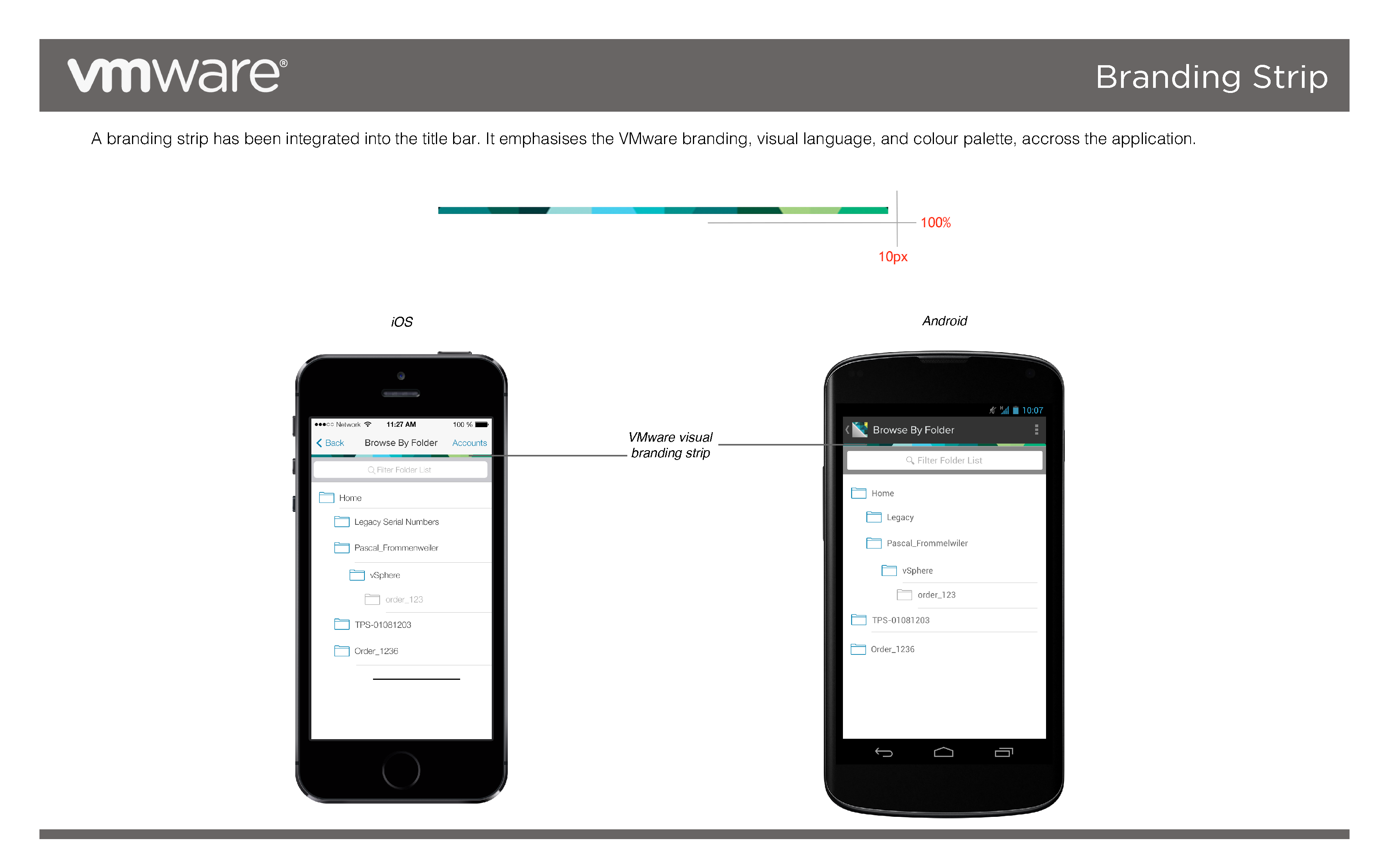
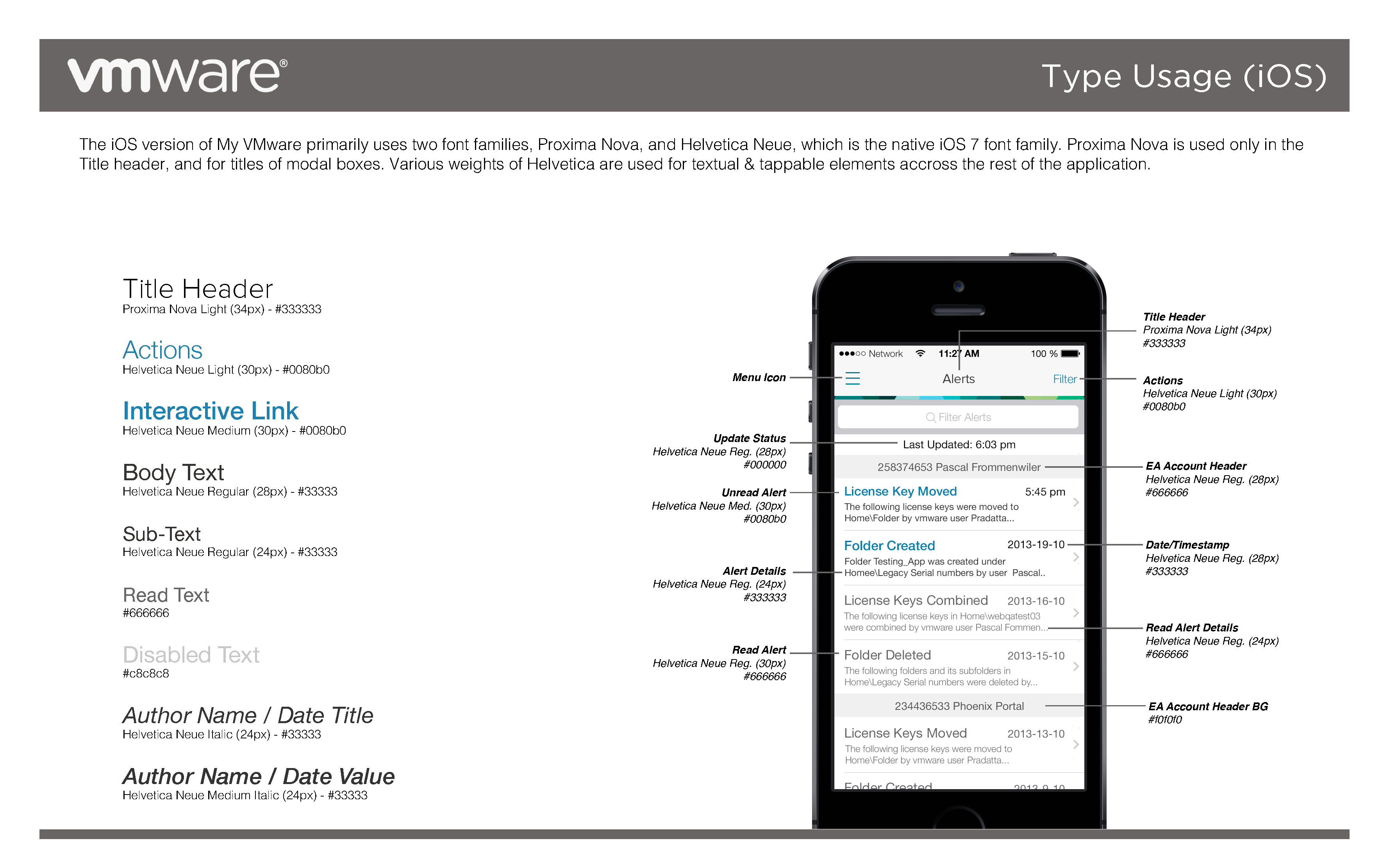
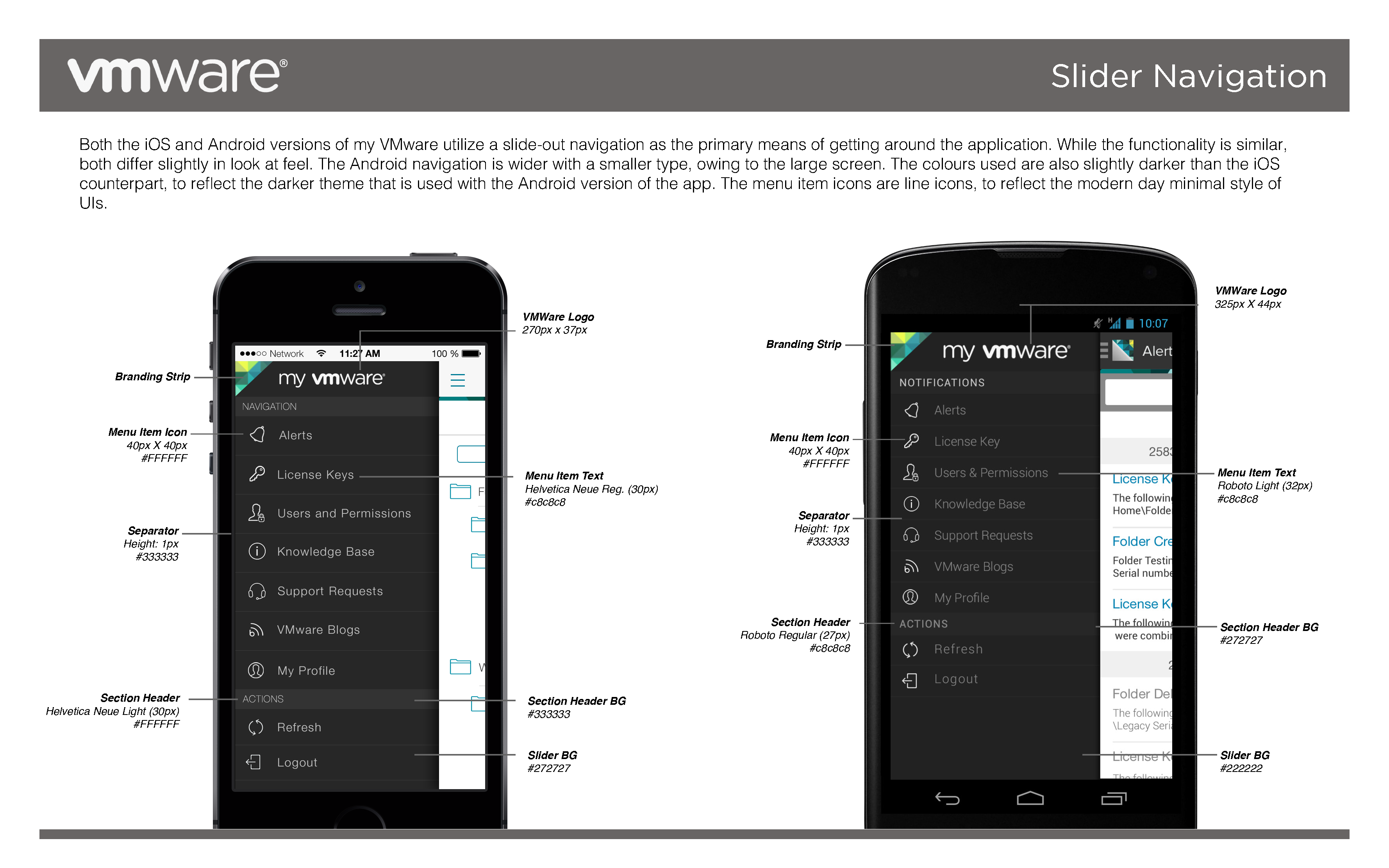
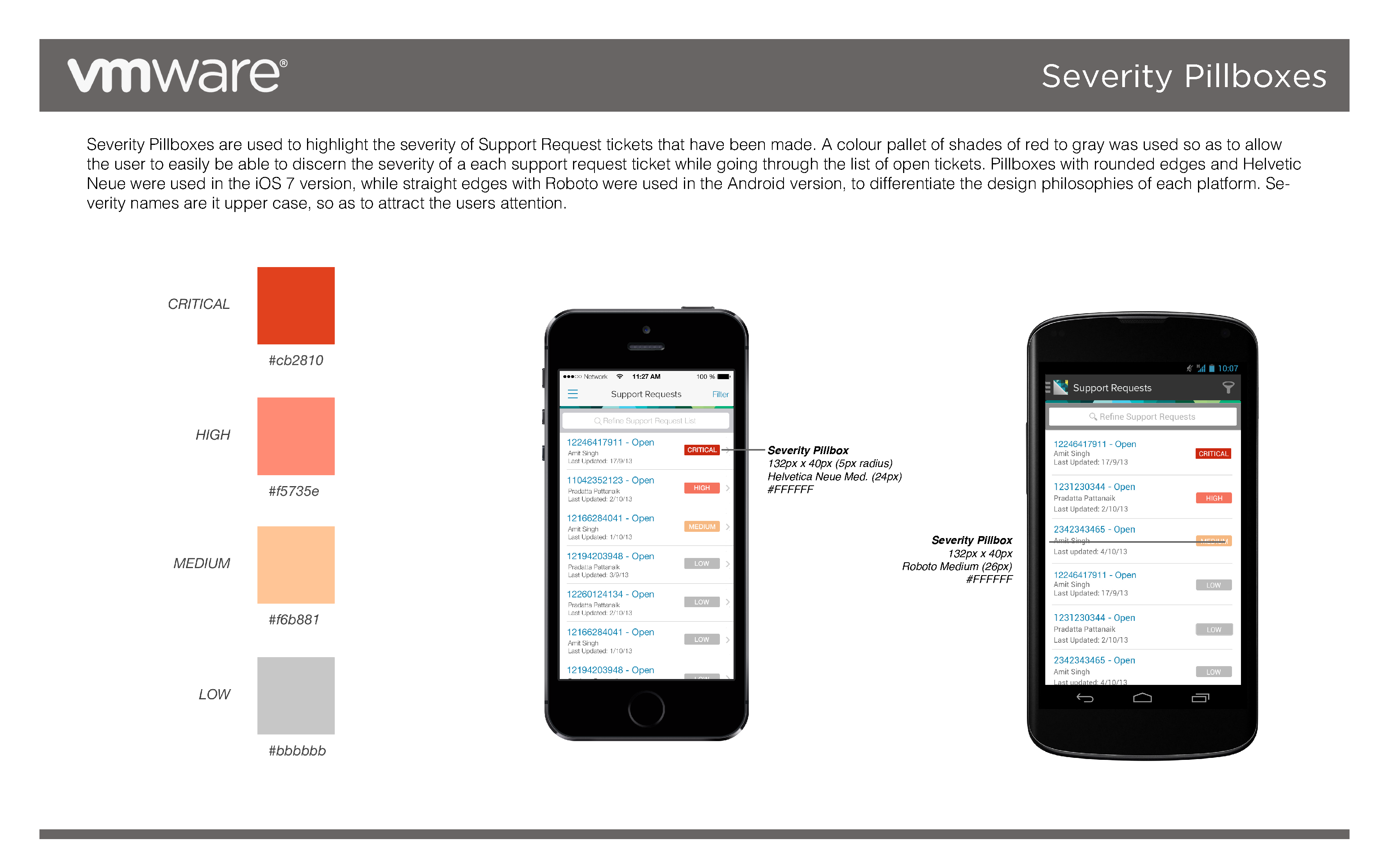
I worked closely with an agency in India called Mindstix. They were supporting My VMware mobile team to design and develop the mobile app. We practiced agile process and daily scrum meetings to brainstorm and redesigned information architect as well as the navigation system based on the previous release design audit and feedback from user studies. We came up with an improved UI Framework, refreshed look and feel for the mobile app and a brand new visual style guide. 

Use Cases

One of the key use cases in My VMware is to allow customers to view answers for frequently asked questions and common support issues. If they couldn't find the information for the issue they're looking for, they may file a support request online or call customer representative for help. Once the support request is filed, they can track status of the request or edit/cancel the request.

User's Mental Model for Filing Support Requests

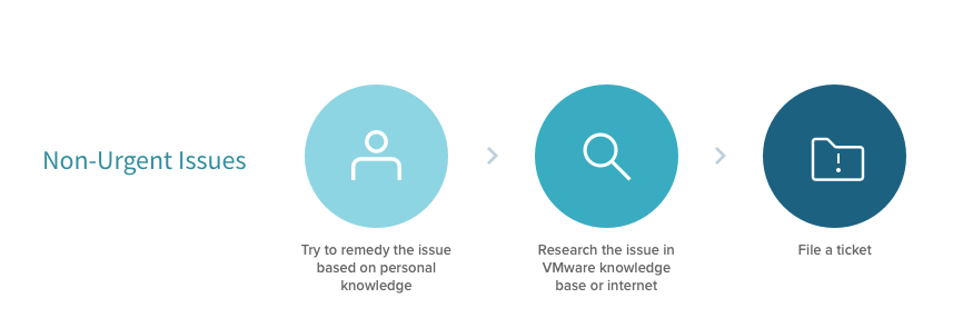
Research Findings - All participants articulated a similar mental model for addressing support tickets on My VMware based on urgency level.

Support Requests Design Improvements

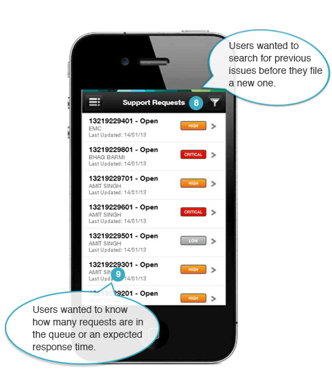
From the users study, we found out some of the participants wanted to search previous tickets before they filed a new one, as they wanted to see if the issue had happened before and how it had been resolved. So for the new design, we added Search and Filtering features to allow users to quickly narrow down to the right tickets.

High Severity Emergency Support

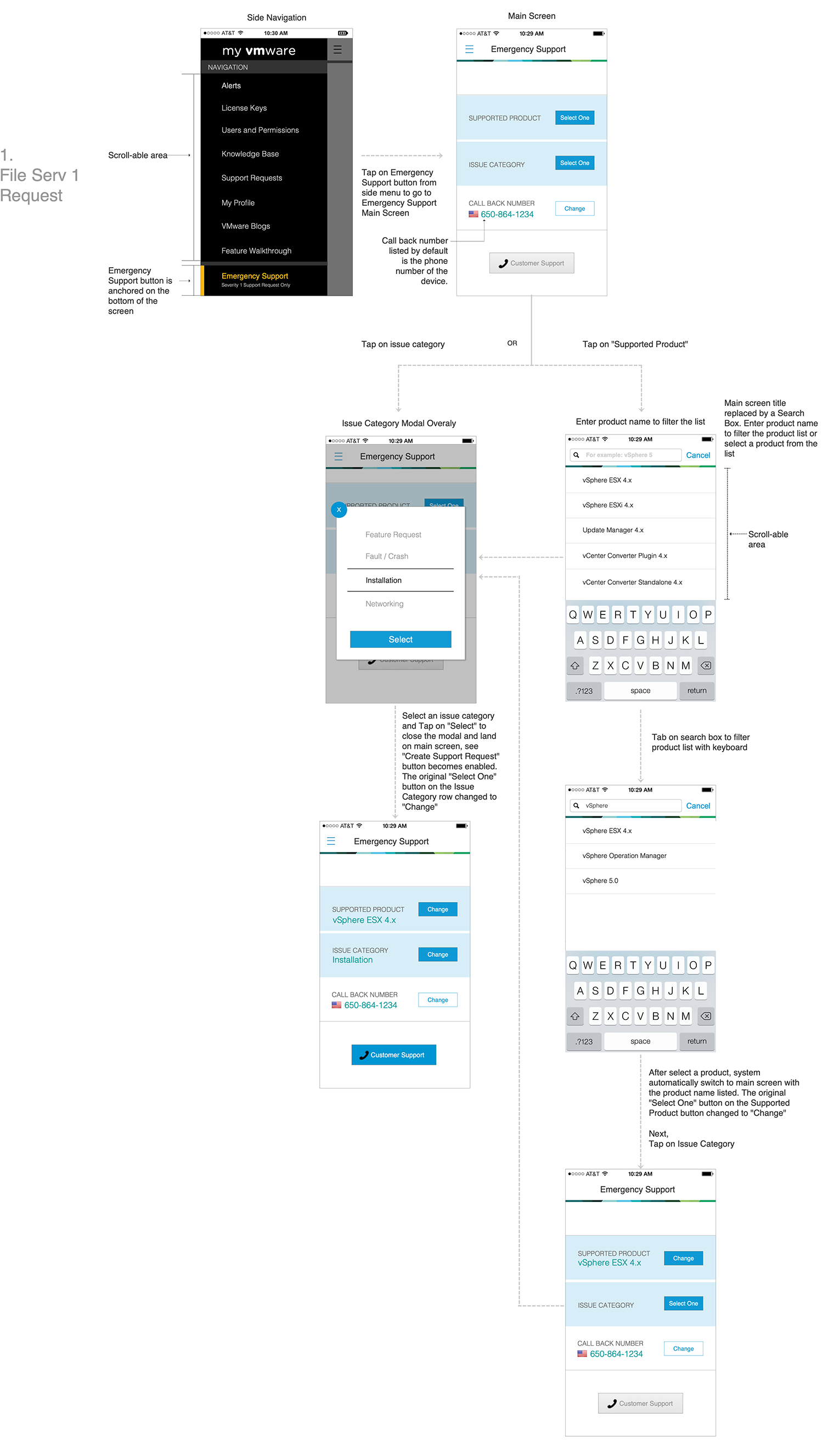
The Severity 1 Emergency Support was a new feature to be added to the existing My VMware mobile that focused on a simplified method for Premier Service’s customers to engage with VMware technical support during critical production impacting (Severity 1) issues. The project was aiming to streamline the support process by leveraging Mobile devices, customer can easily contact support team while away from computer.

I worked closely with PMs and developers in a scrum team process. After completed designing the end-to-end flow and wireframes, I worked closely with developers to review implementation, called out UX defects and provided long-term and short-term solutions for each release.

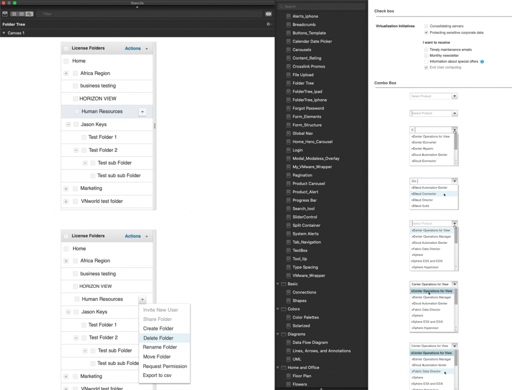
Omnigraffle Stencil

The internal designers use Omnigraffle as the design tool at that time. To help with design productivity and design quality, I led a team of 3 design contractors to deliver a full set of Omnigraffle Stencils of both My VMware mobile and web components. 

Background

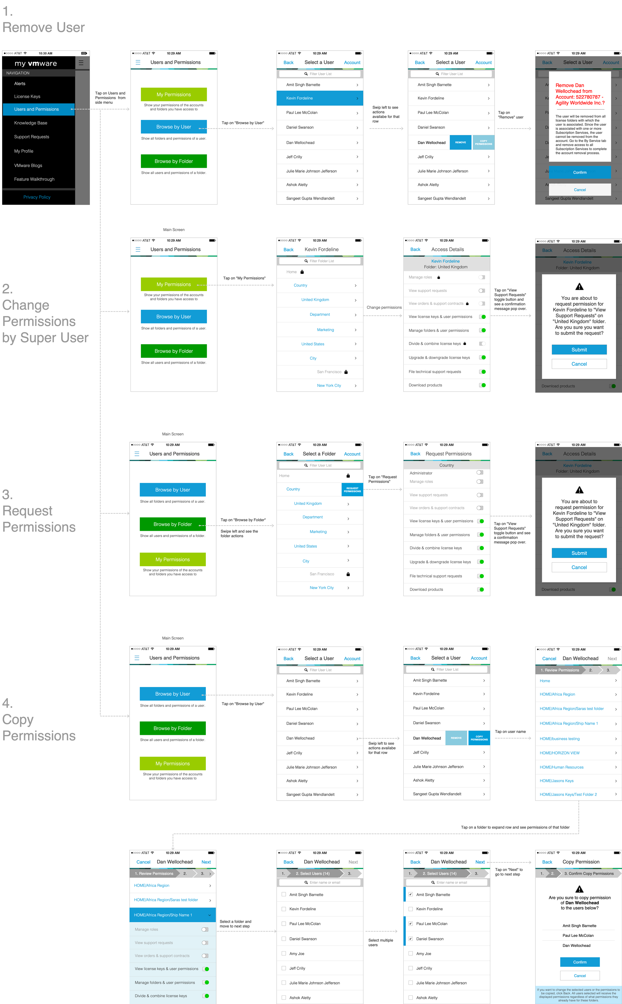
 The application didn't have any editing function from last release. Based on the user study, we learned that System Admins need to manage users and respond to permission requests while away from their computers. They need to quickly add or remove their users from their VMware account. They need to grant or change permissions to view-only, partial edit or full edit, as well as their own permissions. If a new user first start to use My VMware, he/she will need to ask their System Admin to set up the right access for them to use VMware products. The editing functions were essential for System Admins and editing Users Permission was one of the most important features in the app. 

Design Solution

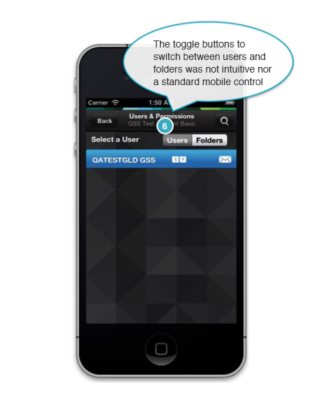
From My VMware web app, System Admin can create folders or categories to group their users (Example: for large enterprises, they may organize their users by department or by locations). If they created folders/categories to group their users in the web app, they will be able to see the same folders in the mobile app. Therefore I created three entry points on the main screen. System Admin can access users and permissions by users or by folder. They can also see their own permissions in a single tap.

"If I was walking the hallways or at lunch and someone said, "oh hey, I need that." Instead of putting a reminder in my phone or telling them to email me, I can go, "I can take care of that right now" and just jump on my phone and do it..."

My VMware mobile active userSystem Admin


MEASURING SUCCESS

Overall, the My VMware Mobile app has accomplished many milestones throughout out 5 releases in 2 years. The download rate of the app has increased dramatically after UX improvement since 2.1. It started in less than 100 downloads from April 2013 to 47,000 downloads (One-Off Downloads) in January 2014. My VMware mobile was also ranked 3rd most downloaded app among all VMware mobile apps in 2014.